Plastic
A Material , A Metaphor
An Interview with Philippe Hyojung Kim
July 28 , 2021
By Side x Side Contemporary
By Side x Side Contemporary

Philippe Hyojung Kim (b. 1989) grew up in a small town outside of Nashville, TN, and moved to Pacific Northwest in 2013. He often experiments with various materials and mediums, in response to his immediate surroundings to make objects and environments that exist in the space between painting and sculpture. His work often references queer identity, artificiality, and language. He has shown nationally at galleries, museums, and alternative art spaces in Denver, Dallas, Los Angeles, Nashville, New York, and Seattle.
Philippe is a current member of SOIL Artist-Run Gallery and a co-founder/curator of Specialist , an experimental art gallery in downtown Seattle. He teaches art and design courses at Seattle Central College and Cornish College of the Arts, and he also serves as one of the curators for Washington State Arts Commission (ARTSWA). Philippe received his MFA in Painting from Central Washington University, and he currently lives and works in Seattle with his husband, Drew, and their dog, Jack.
Philippe is a current member of SOIL Artist-Run Gallery and a co-founder/curator of Specialist , an experimental art gallery in downtown Seattle. He teaches art and design courses at Seattle Central College and Cornish College of the Arts, and he also serves as one of the curators for Washington State Arts Commission (ARTSWA). Philippe received his MFA in Painting from Central Washington University, and he currently lives and works in Seattle with his husband, Drew, and their dog, Jack.
I always drew and painted as a little kid, growing up in China and South Korea. I remember since I was like 5, I took a lot of calligraphy classes where I was introduced to the art of writing and seeing the written language as a form of visual art. In that practice/discipline, from early on, I learned to prepare the ink by grinding the ink stone for hours on end, set up the paper surface with a weight on top, and find the right spot to visualize the composition before starting the first stroke. Of course, as a kid, I would not have known the significance of that, but looking back I feel like that’s when I began to l learn the intimacy of process and materiality in making.
In college, I took some art classes as an elective initially, but I started out as an international relations and economics major. But by the time when I was finishing up my second year of monetary economics and theory classes on Huntington and Fukuyama in late 2000s, I knew I couldn’t stay in that field. I switched gear halfway through my undergrad and have been going at this art thing ever since.

Your work seems to use the materiality of plastic and plastic-based paints as a language to communicate change and adaptation. Do you agree with this, and can you explain more about your interest in plastic as a medium?
My work often starts out as a painting or something that resembles a painting, and especially these days painting is part of a process for me to arrive at something other than that. Paint is a glue that lets my ideas stick. In grad school, I focused on researching paints and their makeup, experimenting with various types of pigments, colorants, binders, solvents, surfactants, etc., and eventually making paintings that are simply made of paint. In that process, I quickly realized most everything I used had some form of plastic in them, hence the malleability and durability. That plasticity in paint is what drove the tension in my earlier work, both materially and metaphorically, and evolved into the work I’m making today.
So, plastic is often thought of as this malleable thing, the ultimate material embodying modernity and universality, but it is perhaps the hardest and the most stubborn material there is. It is hard and stubborn because it refuses its environment, creating a sealant or barrier that remains impermeable to what surrounds it. In fact, once it hardens, it often refuses its own kind to the point where it can only be fused through another heavy thermochemical process. But then, the lifespans of plastic products are often extremely short, and once purpose served, they turn into a kind of “living walking dead” among us. With this zombie mutant material, we have witnessed a total transformation and conception in matter and time, and of course, our perception of matter and time, just as it transforms any and all ecologies that it now composes. Despite, and perhaps because of, this devastatingly idiosyncratic nature, plastic continues to be a source of curiosity for me, if it hasn’t already consumed and become part of me. I’m still learning to deal with it, learning to take care of it, and making something out of it, since it is our making after all.
You reference the “object-ness” of painting that can potentially generate new identities and resist “literal figurations of what is and what has been depicted as being queer.” Can you tell us more about how this takes shape in your work?
Queer to me helps situate a notion of an in-between space, somewhere between visible and invisible, nameable and un-nameable, perhaps yet-to-be-named and not-yet-visible…once uttered, it is no longer that; yet it makes space and is made of space.
Both in the process of making and reading a “painting,” queering takes place through the painting’s imagery and physicality that it asserts, and it allows us to see somewhere in between what is shown and what is not. The object-ness part of a painting records the thoughts and actions through marks made, communicates back some potential for meanings, however unrecognizable or not, and their identities/relations in and with their newly animated world they reside in/on. I like seeing things literally when convenient and necessary, but when something does more than that, that’s when it gets fun and exciting, and kinda queer?
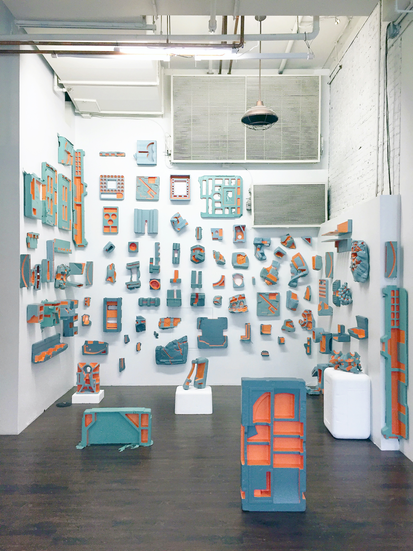
The title of your work “Typology of Absence,” brings up this idea of classification and categorization in terms of similarities and differences; A trace of existence (or being) that seems to tie into the idea of a body, skin and overall identity. What does the “absence” embody for you in this piece?
Absence necessitates a condition of presence, of something or someone at some point, and is remarked by trace, memory, and/or possibility of existence of that something or someone. In Typology of Absence , I wanted to celebrate all the discarded packaging materials found at the local recycling center in their variety and beautifully sculptural nature of the forms. Each and every one of those packaging was at one point designed and manufactured to protect and house something presumably more precious and desirable. Once they served their purpose, they were discarded along with their prescribed utility and/or reasons for existence. Once they were in transit and resettled in the midst of other rejects, many of them got broken, misshapen, and at times defecated by neighboring diapers. (I’m not kidding...) So, I’d clean them up, put a “fresh” coat of paint on them, and highlight their convex and concave negative spaces in between that remarked on their initial “identity.” All this could have made a very somber and sobering effect on the viewers, or even perhaps acting as a satirical snapshot of our post-consumerist society, and I think that part has not gone without notice. But at the end of the day, I wanted to showcase these amazingly unique and beautiful “trash” as something worthy of being on its own, existing in the world as precious as the thing that it once held onto.
The statement for "Typology of Absence" reads as follows: "They’ve been gutted of their meaning. They exist for the other. Their bodies were for others, and their skin made to endure. We don’t know what they once held or held onto. All that remains is a trace of a foregone presence, an empty space filled with the weight of the absence. There, in that in-between space, through the cracks, a potential for selfhood emerges, negotiating their remnant objecthood with their pronounced subjectivity. They are artifacts, reminders for renewal, forever archiving dusts of the present."

Do you see your paintings as interchangeable with sculptural objects? How does the interplay between surface/wall/floor change or affect the viewing of your work?
Yes. Sometimes I make work on a tabletop, and sometimes I make them on a wall; some of them are stored in a flat file, and some of them upright against a wall; some are displayed as a whole as a singular image, and some disparate and broken up. It all depends what the work is doing and how the overall experience with the work changes depending on the orientation. I had shown “paintings” on the floor because they were made to be experienced that way with a certain distance and the intimacy of space in mind. Now I make works that are more deliberately sculptural, but I see them as both a painting and a sculpture, or may be neither.
Color and paint are not only significant in the aesthetic of your work, but also in the environmental issues and ideas of natural and artificial that you explore in your practice. What is some of the inspiration or symbology behind the colors you choose?
Color does different things depending on the surfaces and lighting, right? Color can make something look familiar and recognizable, and it can also make something totally abject and/or otherworldly. It creates space so effortless yet does it so expansively…it can shock and bring immediacy when needed, and it can also hide in plain sight and sustain attention...a tool for codifying meaning and bringing something formless into the visual language. I especially love that aspect of playfulness and responsiveness color can bring about in the work. In Typology work , I relied on the grey-green-taupe industrial/institutional color palette pulled from the left-over recycled latex paint from the recycling center to speak volume for the work I was doing. With (Un)Earthly Delights series , I wanted to emphasize the ever-so-cloying nature of plastic and our addiction to it by using colors that are just as saccharine and artificial with a hint of toxicity. For Plastisphere series , a color chart was provided alongside the installation to invite viewers to code and decode different applications and meanings we associate with colors in different contexts.

Collaboration and curation seem important to your practice. What are some recent community projects in which you have participated?
Oh dear...let’s see...In the last four years or so, with Specialist, a small gallery I run with my artist friends, we’ve been working with emerging artists from the region and out of state to cultivate a more intimate dialogue about contemporary art here in Seattle in its quintessentially quirky DIY spirit. Our exhibitions are often of solo shows that run 6-7 weeks, and in that process, we get to work with each artist directly, and the exhibiting artist ultimately decides on how they would like to present their work, and we facilitate however we can! (We survived through the pandemic, so I think we will keep going for a little while longer!) Also, I’m part of a larger artist collective called SOIL, and it is all about collaboration with the artist communities here and beyond. Being part of these communities has really been indispensable in growing my own practice as an artist and my career as an educator and a curator.
Speaking of, I've recently finished a year-long curatorial project with Washington State Arts Commission (ARTSWA) to purchase and bring artworks by regional and international artists to a small rural community in Central Washington, to be permanently installed at Simcoe Elementary in Wapato, WA.
My main goal as a curator in this project was to directly reflect and represent this diverse, multicultural, multigenerational community by selecting artworks made by women artists, artists of color, immigrant artists, and queer artists from the region and beyond. To give you a little bit more background, Simcoe Elementary is a brand new K-3 elementary school that was built just about 2 years ago, and the students and their community that the school serves are very diverse with the majority of the student body representing Native, Hispanic/Latinx, and Filipino American communities in Wapato, WA. The city also has a very rich and dynamic cultural and historic landscape in that the ground it stands on is part of the larger Yakama Nation. With this in mind, I worked with two Native American artists from Washington, two Latinx artists, one Filipino artist, and three regional artists to bring together a collection of artworks that are worth $75K+, providing opportunities to these artists especially during the socioeconomic hardship we went through and are still facing due to the pandemic.

This past year has both slowed creative work and generated new ways of making for many artists. How has the pandemic affected your creative practice? Have you been working on any projects inspired by this time frame?
Ever since the pandemic, I have converted part of my studio into an office/classroom to teach all my classes, so it’s been interesting to see the changes in my work throughout last year and a half. There are days that I find difficult to make work after teaching all day, but for a time since my studio was the only place I could go safely without running into anyone, I was able to crank out a lot of work. Although many of the shows scheduled had to be postponed, I’ve been able to spend more time to try out some new materials and experiment with them, making smaller works in batches that can be stored easily to be incorporated into an installation later on. Now that some of the shows are rescheduled, it’s time for me to plan out some new installs!
Do you have anything you’d like to share with our community (any artist resources, inspirations, etc.?)
Seattle may have a smaller art scene compared to LA or NYC, but we do have very vibrant artist communities here and lots of opportunities! I am always looking to bring exciting artists and their work to this community through my practice, so please feel free to reach out to me via my Instagram @philippepirrip, or through my galleries, @soilart and @specialist_sea !
*For more information on Philippe Hyojung Kim’s work, please visit his website and Instagram.
Interview by:
Side x Side Contemporary
Krista Brand & Mana Mehrabian
Image list:
Image 1: Philippe Hyojung Kim, Immigration Series: "deICEd", USCIS-issued employment authorization card, ice, rosemary, weeds, soil, plastic tray, 5" x 12" x 12", 2019
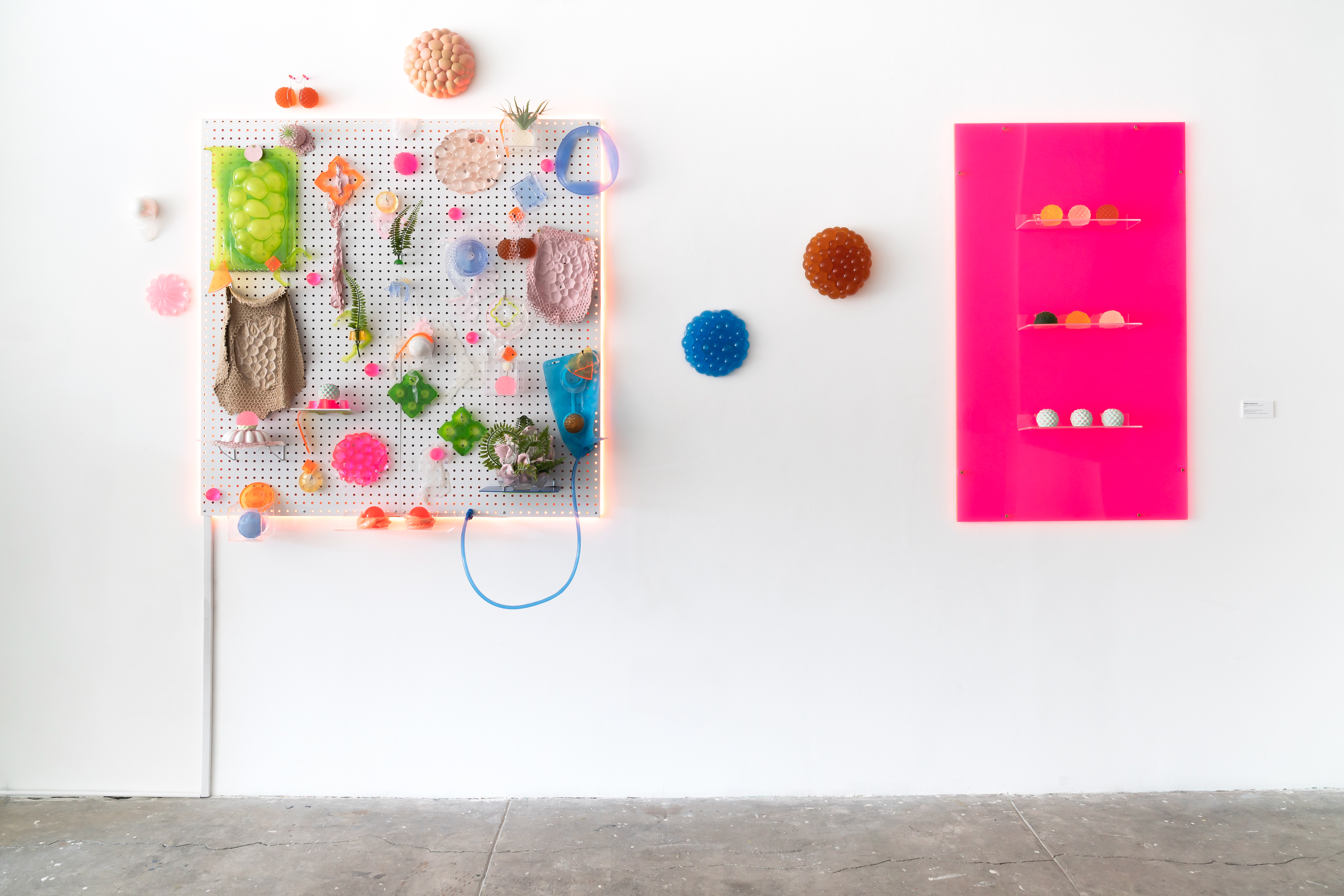
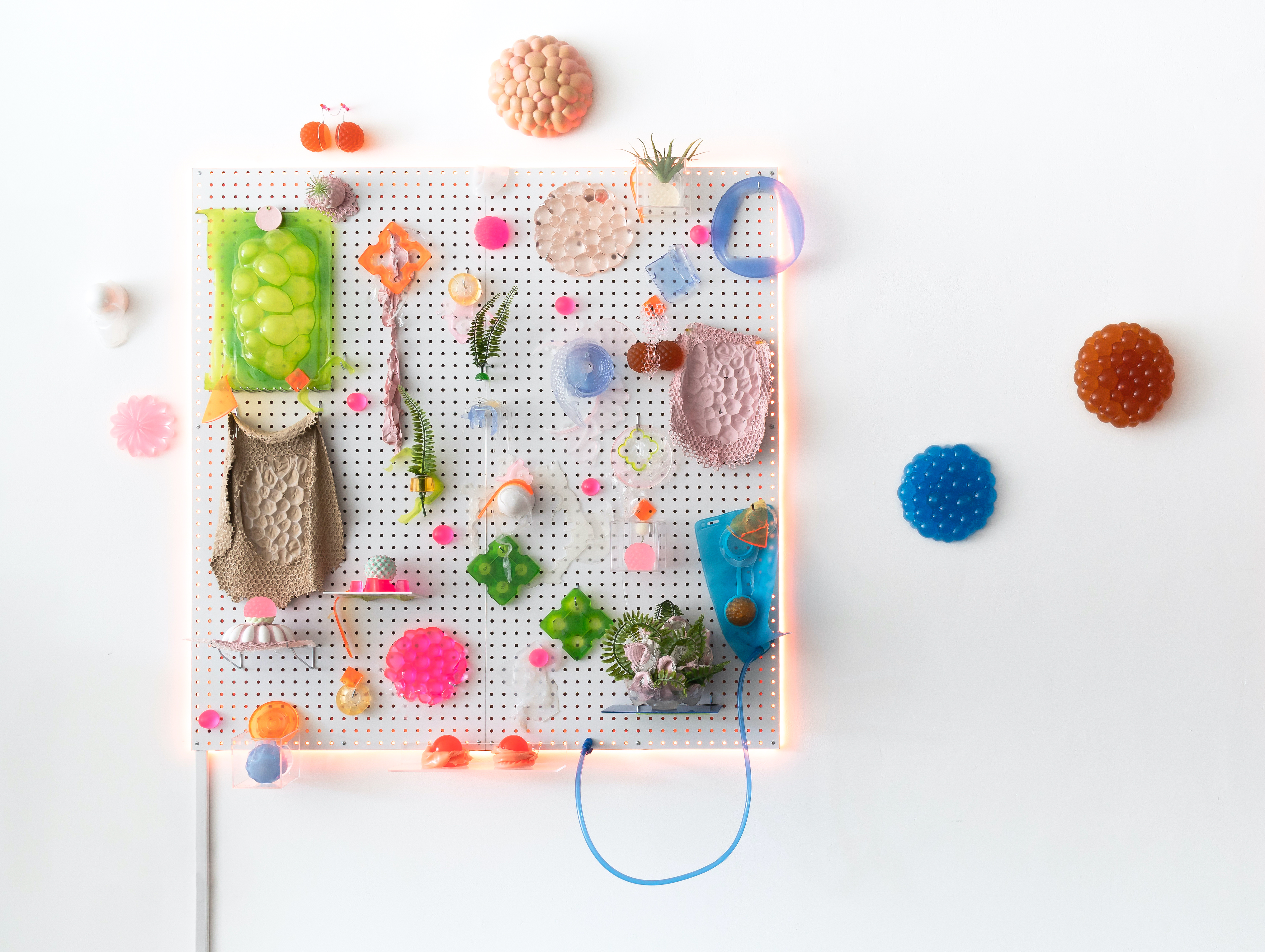
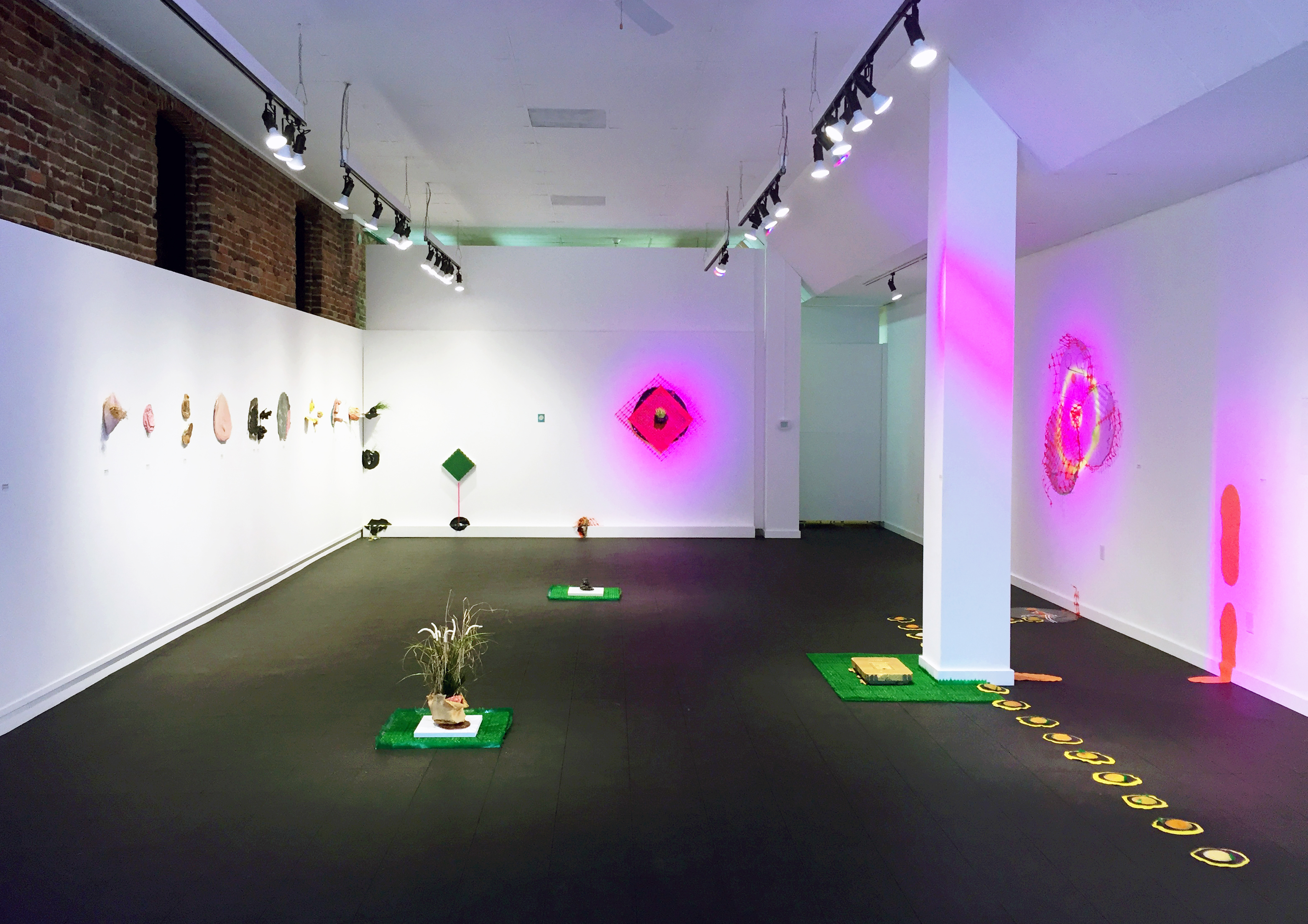
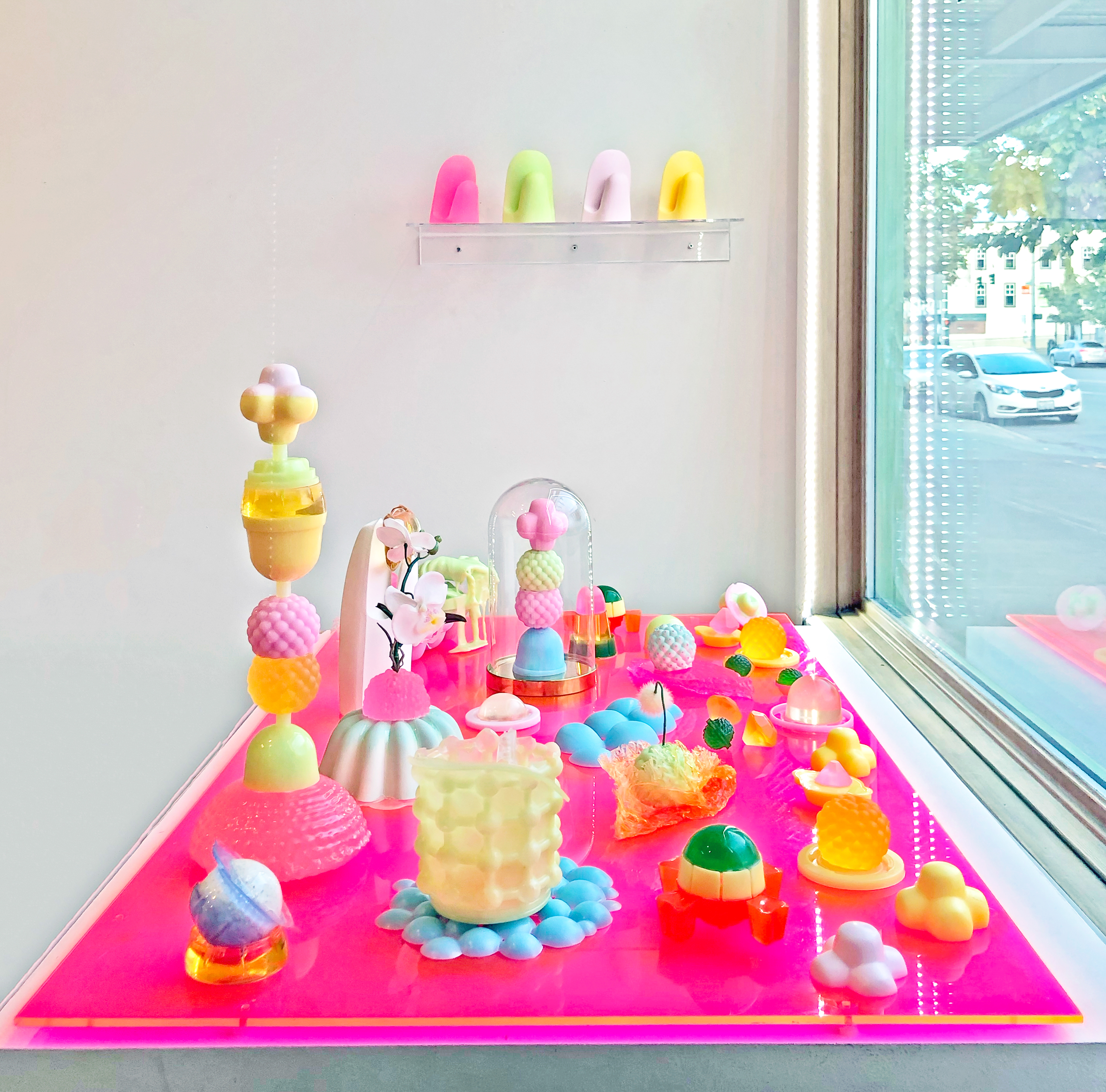
Image 2: Philippe Hyojung Kim, (Un)Earthly Delights, Mixed media installation w/ urethane resin, rubber, silicone, plaster casts, LED light, 54” x 48” x 6”, 2020
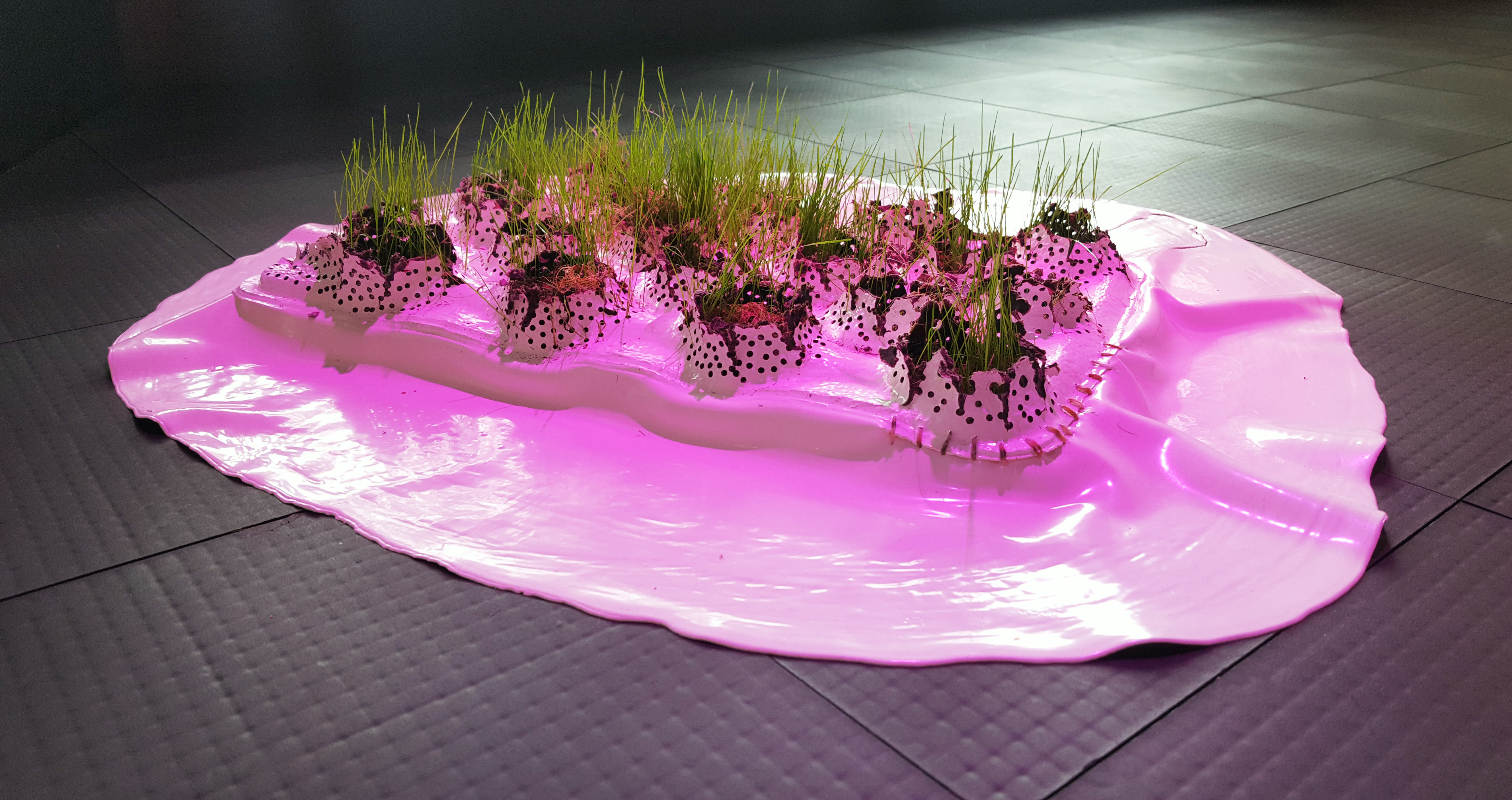
Image 3: Philippe Hyojung Kim, Next on Planet Earth: Plastisphere, Latex-Enamel Paint, Cardboard (Apple Trays), Soil, Grass, 6” x 24" x 26", 2017
Image 4: Philippe Hyojung Kim,Typology of Absence, Latex-enamel paint on polystyrene and polyethylene foams, 216" x 196" x 120" (Install Dimensions), 2018, Photo Credit: Jueqian Fang
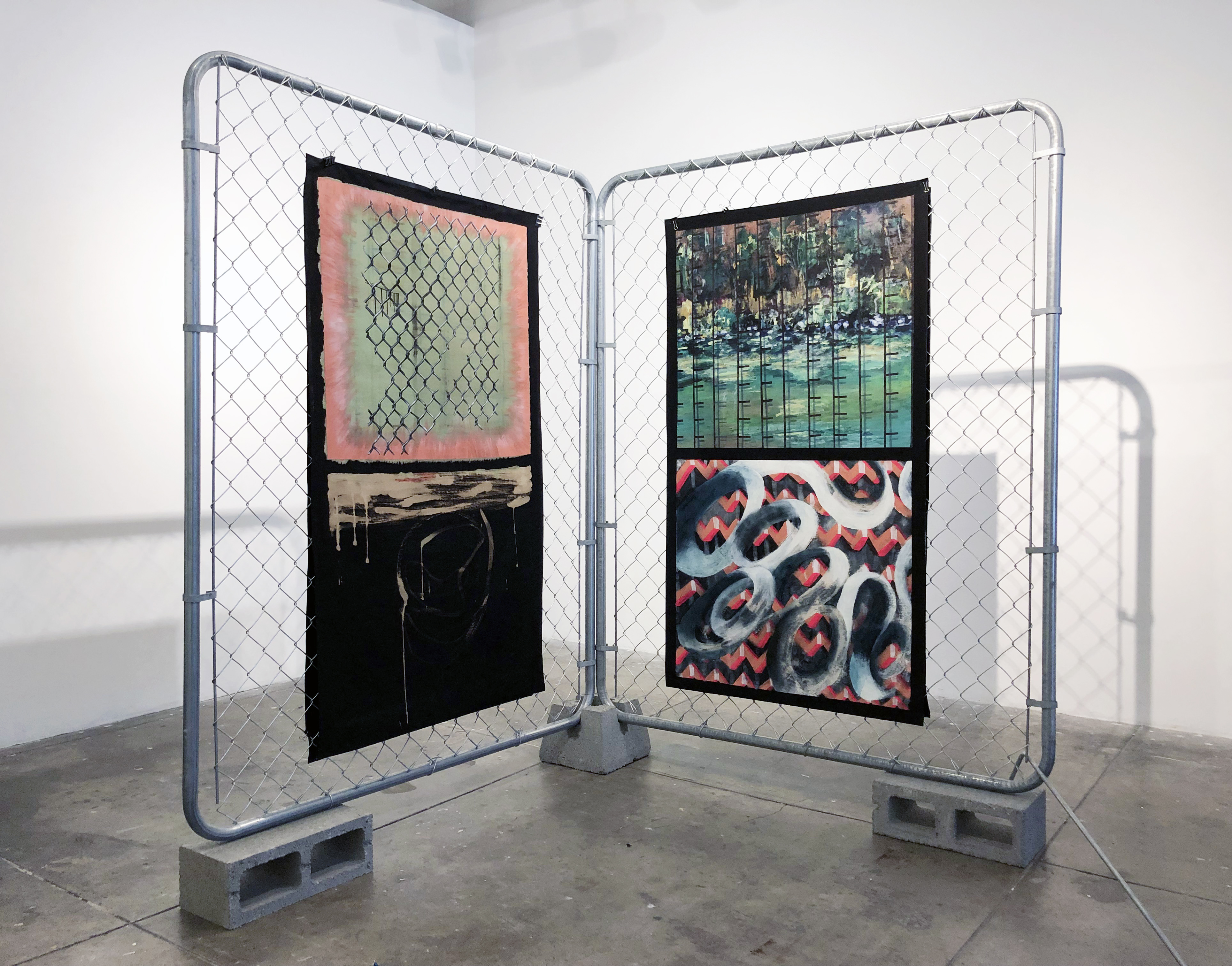
Image 5: Philippe Hyojung Kim, Immigration Series: "New Werxxx", Chain-link fences, airbrush, acrylic, and bleach on denim, 90" x 96" x 48”, 2019
Image 6: Philippe Hyojung Kim, Plastisphere Earthlings (Install detail and Color guide), Latex-enamel paint, latex, polyurethane, plastic grass, soil, dried plant, “sushi grass”, synthetic grass tiles, 40” x 36” x 36”, 2017
Image 7: Philippe Hyojung Kim, Immigration Series: "Have You Ever...", USCIS-issued Envelopes, plastic sheets, thread, 700 pennies, soil, grass, carved wood, LED grow lights, and Green Card (USCIS-issued Permanent Resident Card), 36" x 64" x 12", 2017.
Image 8: Philippe Hyojung Kim, The Gilded Cage 1: Jelly Field, Mixed media installation w/ urethane resin and plaster casts, 18" x 48" x 30", 2020
Image 1: Philippe Hyojung Kim, Immigration Series: "deICEd", USCIS-issued employment authorization card, ice, rosemary, weeds, soil, plastic tray, 5" x 12" x 12", 2019
Image 2: Philippe Hyojung Kim, (Un)Earthly Delights, Mixed media installation w/ urethane resin, rubber, silicone, plaster casts, LED light, 54” x 48” x 6”, 2020
Image 3: Philippe Hyojung Kim, Next on Planet Earth: Plastisphere, Latex-Enamel Paint, Cardboard (Apple Trays), Soil, Grass, 6” x 24" x 26", 2017
Image 4: Philippe Hyojung Kim,Typology of Absence, Latex-enamel paint on polystyrene and polyethylene foams, 216" x 196" x 120" (Install Dimensions), 2018, Photo Credit: Jueqian Fang
Image 5: Philippe Hyojung Kim, Immigration Series: "New Werxxx", Chain-link fences, airbrush, acrylic, and bleach on denim, 90" x 96" x 48”, 2019
Image 6: Philippe Hyojung Kim, Plastisphere Earthlings (Install detail and Color guide), Latex-enamel paint, latex, polyurethane, plastic grass, soil, dried plant, “sushi grass”, synthetic grass tiles, 40” x 36” x 36”, 2017
Image 7: Philippe Hyojung Kim, Immigration Series: "Have You Ever...", USCIS-issued Envelopes, plastic sheets, thread, 700 pennies, soil, grass, carved wood, LED grow lights, and Green Card (USCIS-issued Permanent Resident Card), 36" x 64" x 12", 2017.
Image 8: Philippe Hyojung Kim, The Gilded Cage 1: Jelly Field, Mixed media installation w/ urethane resin and plaster casts, 18" x 48" x 30", 2020
© All Images courtesy of the artist